#B2B #SaaS #WMS #led UX design2023-now
Car dealership inventory management system
As the UX Design Lead for this project, my role involved close collaboration with product managers, designers, and engineers. Together, we executed designs that aimed to enhance the efficiency of cardealer/warehouse users in managing and processing orders.Enhancing user
efficiency and productivity

Background
Car dealership inventory management system WMS (Warehouse Management System) is an enterprise SaaS product providing a comprehensive range of features to help car dealer track vehicle inventory, manage customer order, and analyze the company's financial situation.
By prioritizing usability and seamless functionality, we aimed to enhance the overall user experience and provide a comprehensive solution for efficient car dealership operations.
Team
Michael, Product Manager
Tingting Jin, Lead Experience Design
Lida, UX design
DELIVERABLES
Concept development
Wireframes
User experience
Visual design
• Reduce customer churn
• Streamlining processes
• Engaging users through extensive contextual dashboards
Goal

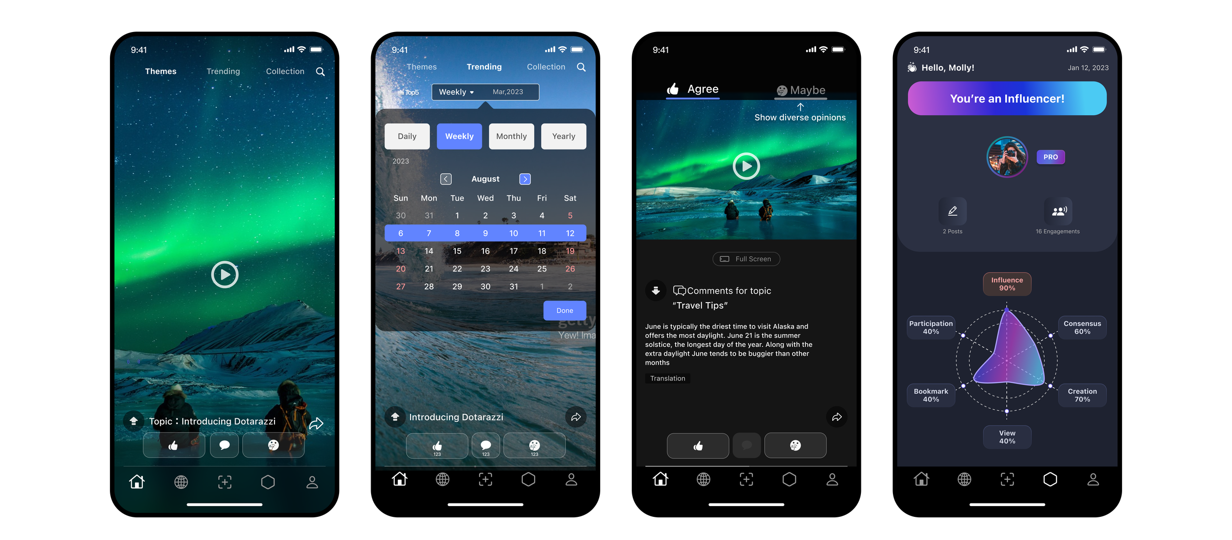
Previous version of Dotarazzi
The primary function of the Dotrazzi app is to encourage users to share and capture a variety of trending topics.
The objective was to establish a strong foundation that could accommodate a startup business and cater to a diverse user base, while also attracting more users.
An easy-to-use interface for sharing and exploring
Encourages more positive and productive interactions
Build a content-driven platform that encompasses diverse perspectives.
The Challenge and Goal
Who are our primary users? Are they individuals with prior experience using social media, or is the audience more diverse?
What pain points do our users encounter that could be addressed with our product?
In what ways can we differentiate our product from other offerings in the market?
Empathize the users
The essence of sharing and intrinsic motivation:
The original task was simple:
Record and share.
To learn the user pattern, here is what I did:
I conducted usability testing of the app with four
participants, each assigned a simple task.
The objectives were to identify any challenges users
faced, explore their preferences, measure engagement,
and uncover any existing or potential problems.
What I found out:

What I‘ve learned:
Through observing users' interactions with this app, I have identified several unexpected issues.
Here are the conclusions:
Firstly, throughout the entire user journey, users who are familiar with social media have a strong desire to explore content, but the design of the previous version did not provide clear guidance for users.
Secondly, in the sharing process, users are more concerned with how to quickly share their views, and convoluted steps can dampen their desire to share.
As a result, improvements can be made in these areas to enhance the user experience.
Reshape the sharing process and enhance user engagement.
If users struggle to capture and share fleeting moments seamlessly while on the go, at home, or during celebratory occasions, their sharing experience may be negatively impacted by spending excessive time adjusting content before publishing.
Before touching the design, I conducted an analysis of the app's user data.
I discovered that the success rates of the app's primary functions, browsing and publishing, were lower than desired. Users were required to expend more time and effort in order to familiarize themselves with the platform, despite their presumed familiarity with social media.
These findings revealed a discrepancy between the user experience and the developer's intended goals.
Data Analysis

What I found out on closer inspection:

Recap the main problem.
The main issue with the app is that the currently designed features deviate from the intended product positioning. The primary function of the product is to enable users to quickly share their experiences, but the unclear prioritization has caused confusion along the way.
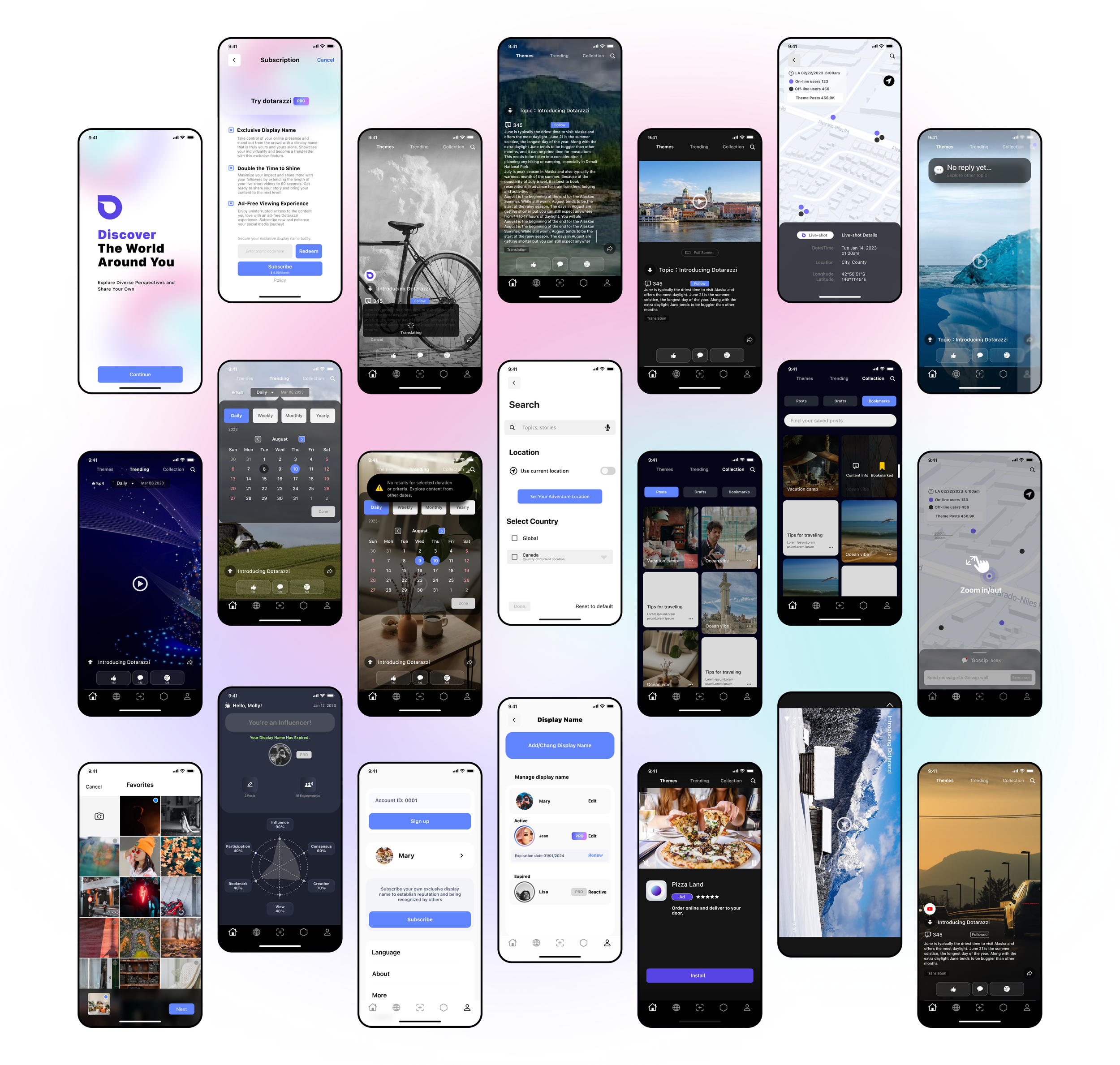
Dotarazzi Redesign

With our app, users can effortlessly share the memorable moments of their daily lives with the world.
Ensuring that their unique perspective is heard loud and clear, engaging diverse perspectives with an open mind.
Main Features
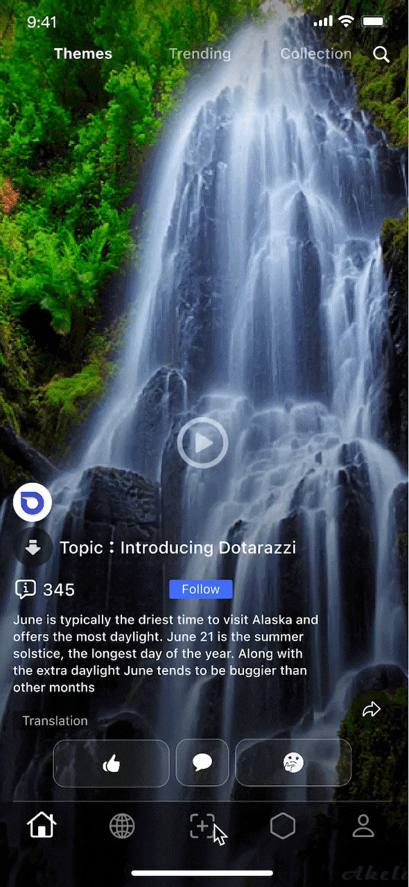
Get straight to the content
• Stay engaged with the topics that interest you.
• Expand to read the content summary.
• Feel free to express your opinions.
Seamless posting process
• Hold the record button to capture live videos, users can always save drafts for later use.
• Set up all settings at once, and make minor adjustments next time.
Hear different voices
• Amplify your voice and make your opinions heard with confidence.
• Effortlessly explore comments with differing viewpoints.
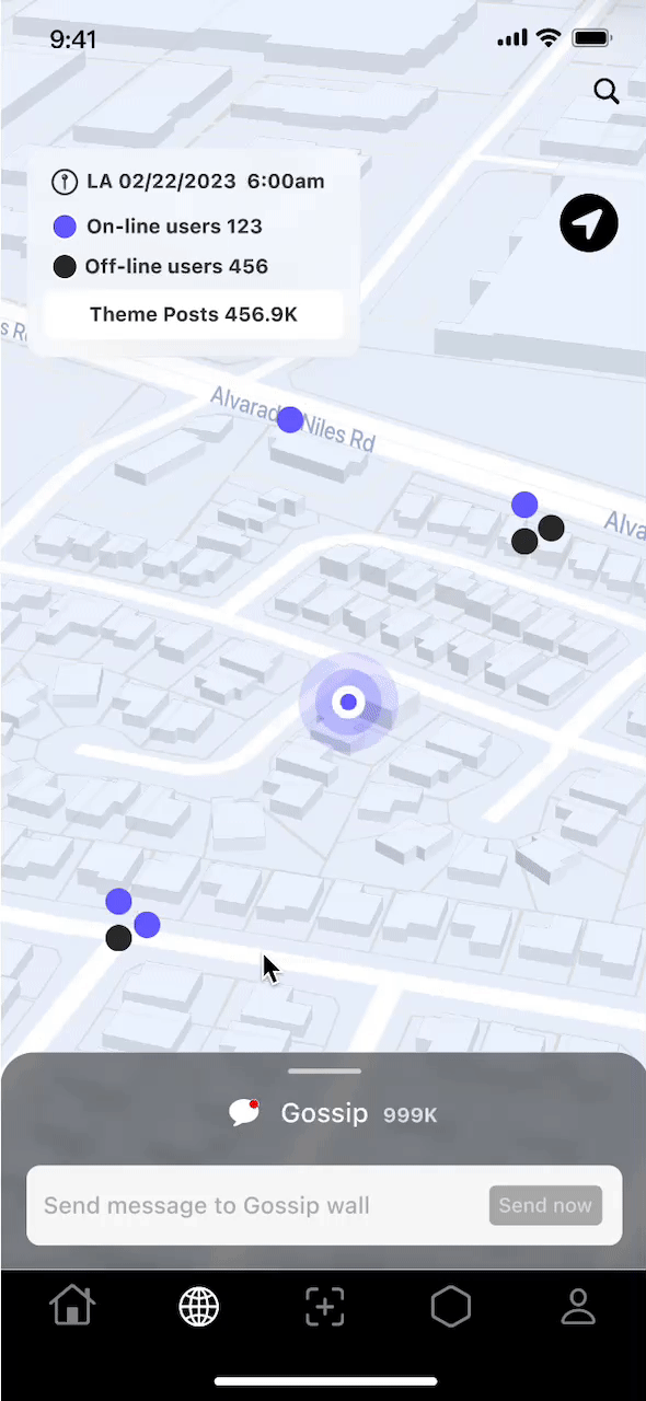
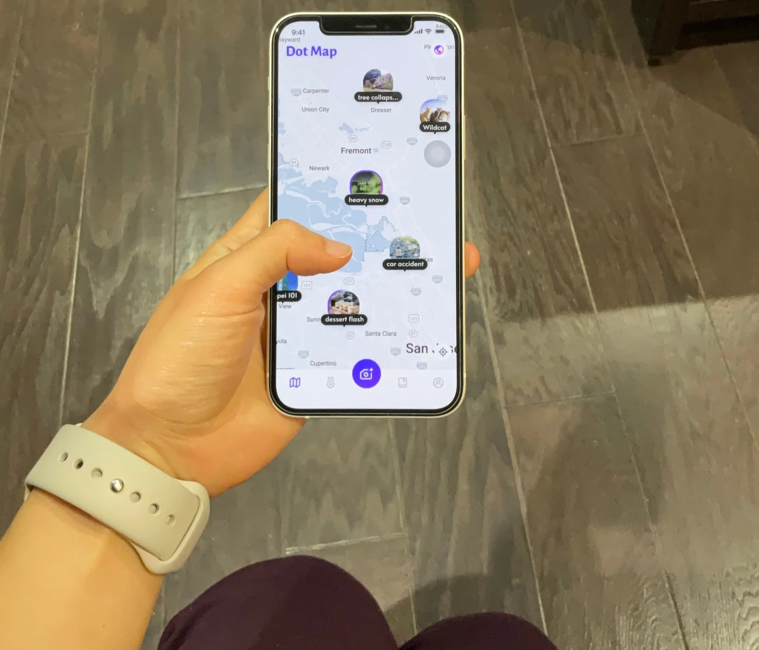
Stay up-to-date on the latest global trends with ease - we've got you covered!
• Set a destination anywhere in the world and discover what people are up to.
• Discover your local community and share the latest news.
Persona
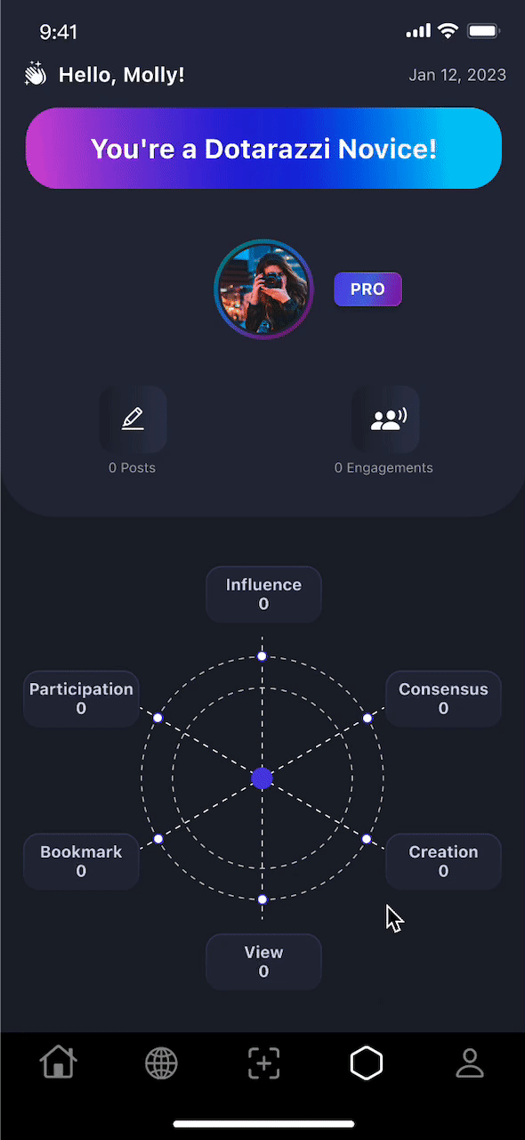
• User will gain a badge based on their engagement data.
The process & challenge
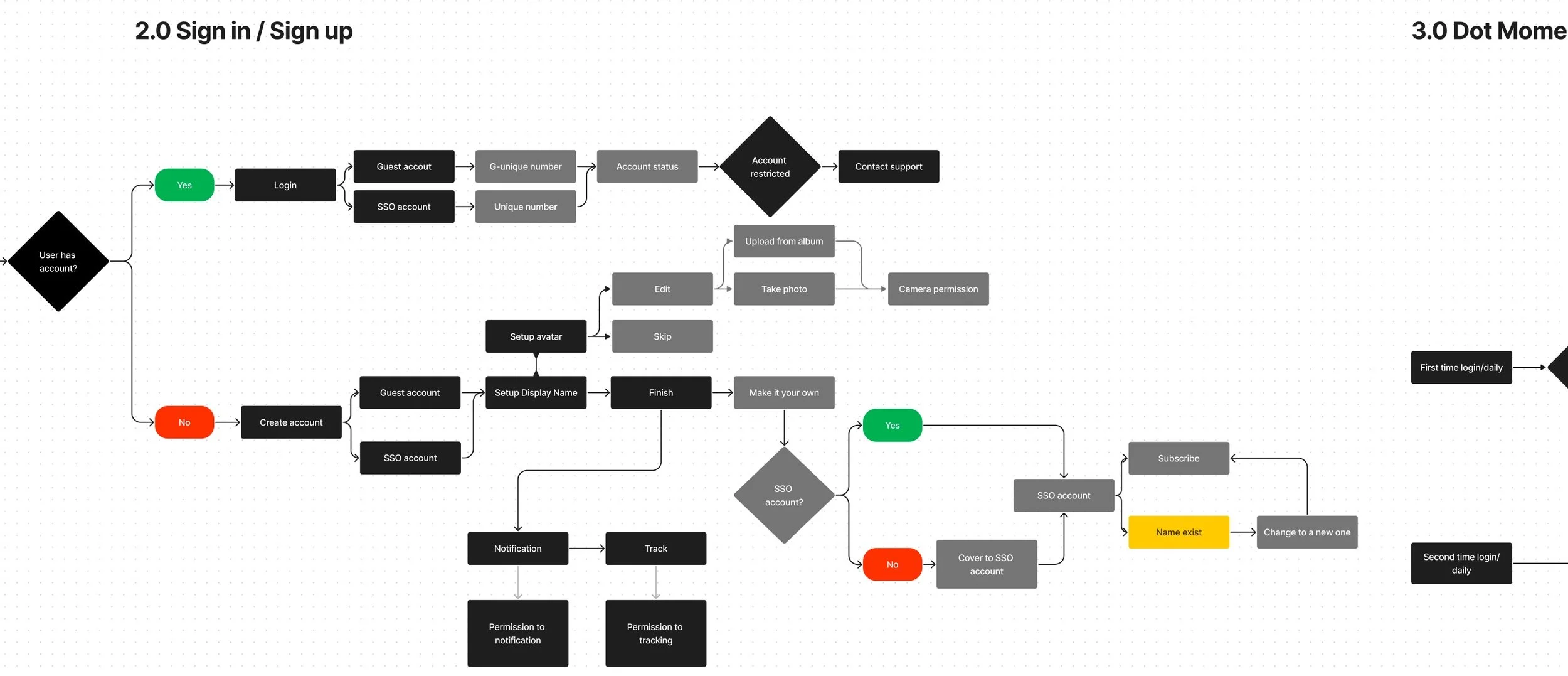
Click the image to see the full version
User Flow
Prioritize the main problems:
• How to explore/share content right away?
• What is the user’s motivation?
• How to make users engage?
At the early stage of the design process, I conducted a user flow map to better streamline the entire process, including as many user actions as possible.
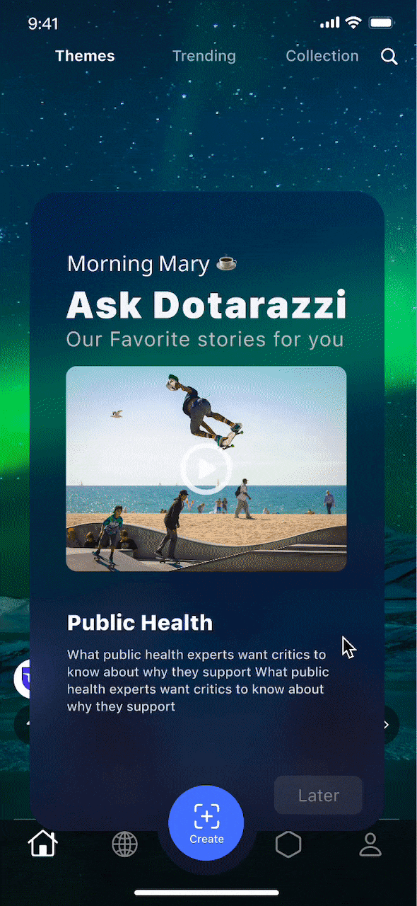
Decision-making

I initially added the subscription option right after the registration process.
However, I later realized that it might come across as too aggressive for first-time users. To address this issue, I decided to change the size of the "Continue" button to be the same size as the "Later" button. At this stage, our primary goal was to inform users about the subscription option without causing any unnecessary anxiety.
After considering different options, we decided to go with version 2.0 where both buttons were presented at the same level. This proved to be more clickable for users and reduced the chance of getting annoyed or frustrated.
First time onboarding process
Home screen: Explore endless content around the world.

The platform has a primary focus on topics instead of individuals. Anyone can make their opinion influential without being a 10k follower influencer.
By allowing users to follow specific topics instead of individuals, this feature promotes user autonomy and can increase engagement.
By checking the information icon on a piece of content, the user can see the engagement rate of that post.
Additionally, users can search for popular topics in specific areas.
Integrate volition into the exploration user experience.
Design Iteration: What is the challenge and how to make a design decision?

In mode 1, we first used a sidebar to let users express their attitudes. Later on, the conclusion of user testing showed that it weakened the purpose of “encouraging express viewpoints”.
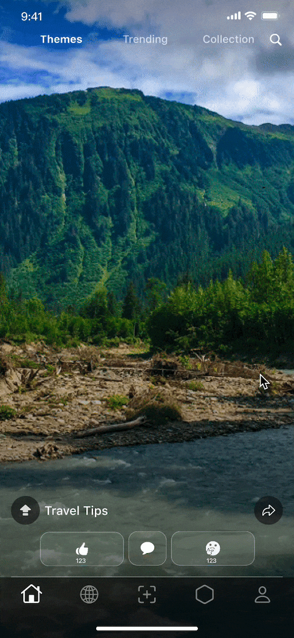
In Mode 2, the “like” and “dislike” buttons were placed at the bottom to highlight the main function.
After two more rounds of testing, I prioritized the task spectrum again. Resulting in replacing the dislike button with a thinking button to reduce negative interactions and encourage users to express different opinions.
How to elevate the “Moment” experience
Enable users to swipe through various opinions based on their volition rather than the algorithm. Users may either agree with the topic or have something else to share.
The structural integrity of “Comment”
It allows users to post text content or other media.

The last
• If I had more time, I would conduct additional behavioral research and perform necessary user tests to ensure that we address all minor issues.
• In the future, I aim to explore more heuristic evaluation and usability testing to enhance engagement rates from a design perspective.
• By observing users in various scenarios, we can better understand if their goals extend beyond exploring / sharing.