Top Out door pre-work health supps brands
Truwild
2020, UX in online business
Role
User experience research
Branding development
user experience
visual design
Scope
Branding definition
Information Architecture
Wireframe & visual
User testing
TRUWILD offers a seamless online shopping experience for
customers who are outdoor athletes.
The Challenge
How can we guide customers from third-party dealers to the official website?
How might we reduce the steps in the shopping process and optimize
the user flow to improve the conversion rate and provide a seamless experience?
Background
Truwild's supplement line is specifically designed for outdoor athletes
to enhance their performance in challenging natural environments, setting
it apart from traditional supplements that cater to indoor gym-goers.
Challenge
Build connection with customer.
The current store features a basic product listing, but fails to effectively
communicate the brand to the target audience and differentiate itself
from other supplement stores.
What I found
Our focus will be on creating a clear and intuitive user interface that encourages
consumers to browse, learn about the products, and make purchases with ease.
To create a simple, user-friendly online store that represents their branding value.
Our Goal
To establish a strong connection between the brand and users.
The new experience will build upon the existing Truwild site, allowing users to have more control over advanced aspects of the site in order to minimize user learning barriers.
Define the user and the problem.
Solution
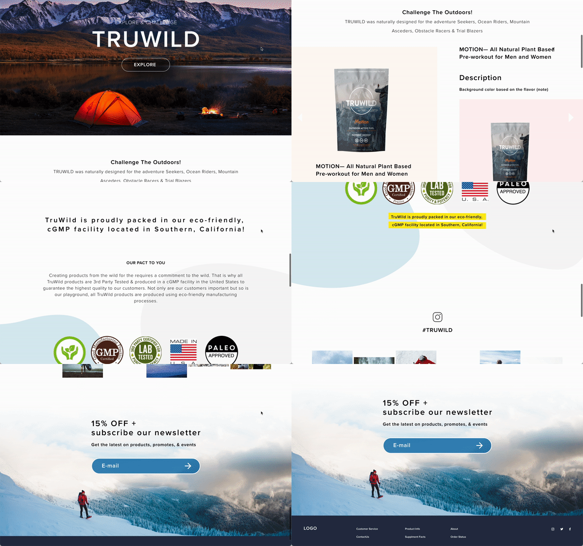
• Home page
Outdoor athletes enjoy sharing their adventures on social media platforms. By integrating social media functionalities, we can facilitate user engagement and foster a stronger connection between users and the brand. This approach aims to enhance customer loyalty and build lasting relationships with our target audience.
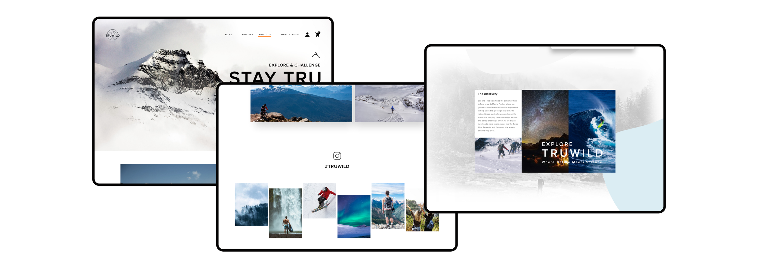
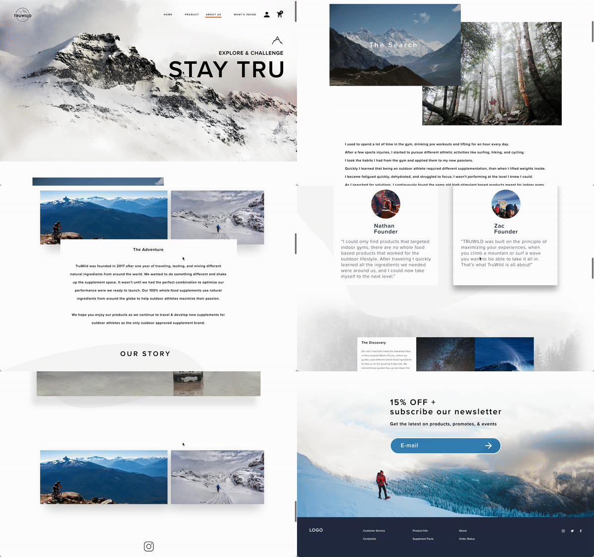
• Brand story
TruWild is created by athletes who understand the needs and preferences of their target customers.
During a meeting with the founder, we identified a key opportunity to build an emotional bridge between the brand and its customers.
By leveraging this feature, we can establish a deeper connection and resonate with customers on a more personal level, further strengthening their loyalty and trust in the brand.
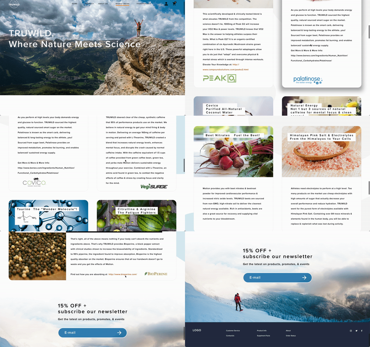
• Ingredients Education
By utilizing a concise information card design, we can effectively communicate the ingredients of the product to users.
The primary goal is to educate users about the energy and benefits that these ingredients can provide to their body through clear and succinct descriptions.
This approach ensures that important information is readily available and easily digestible, empowering users to make informed decisions about their supplement choices.
Outcome
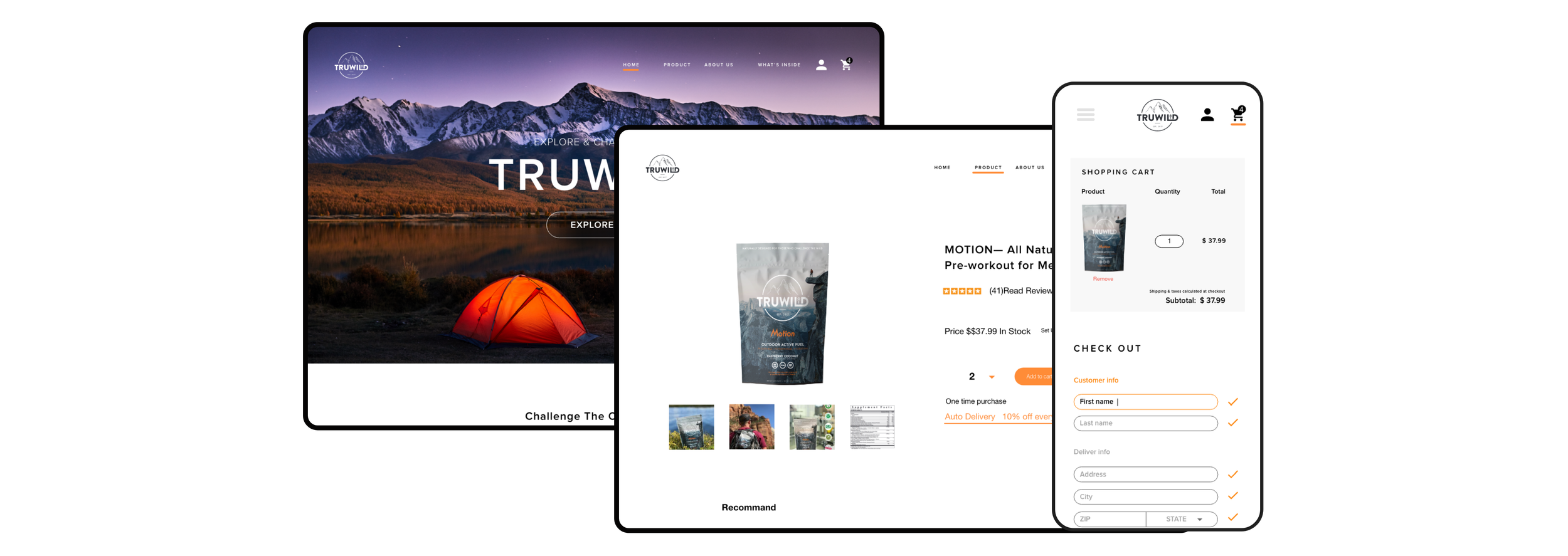
By deeply understanding the needs of our target user group, I prioritized the design of three key functions to address the existing pain points of outdoor customers. The first focus was on simplifying the checkout and payment process, ensuring a smooth and hassle-free experience for users.
The second focus was on providing customers with a better understanding of the ingredients through clear and concise information.
Lastly, create an emotional bond between the brand and the consumers. By incorporating elements that resonate with outdoor enthusiasts, such as captivating imagery, inspiring stories, and interactive features, we fostered a sense of connection and loyalty.
Since the launch of the website, we have observed significant improvements in user retention rates, reduced order placement times, and an increase in repeat purchases. These positive outcomes validate the effectiveness of our design approach and the value it brings to the users and the brand.

